How to style forms with tailwind
Default Styling
Browsers apply default styling to input elements. This makes it harder to style them.
For example, the following input element:
<input></input>
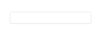
Looks same in Chrome and Firefox:

If you focus an element in Firefox, it has a red border:
however in chrome, the border appears to be black:
If you don't know about it, you may search inside the inspection tool the entire day, because you don't understand which rule is creating this orange border.
Tailwind itself's offers a form reset plugin https://github.com/tailwindlabs/tailwindcss-forms.
The plugin can be installed with npm and has to be added to the tailwind config:
// tailwind.config.js
module.exports = {
  theme: {
    // ...
  },
  plugins: [
    require('@tailwindcss/forms'),
    // ...
  ],
}
However, the input style will only be reset if input type has been set. So, in this case we need to change the html to
<input class="m-10 h-10" type="text"/>
Focusing the input field will now look like this:

Tailwind Forms will apply a default blue border and a blue ring. In tailwind, a ring is a combination of the CSS outline and shadow property.
If you want to remove the ring and border on focus, you need to add something like this:
<input class="m-10 h-10 focus:ring-0 focus:border-black border-black" type="text"/>
With this base, you can now use your own coloring of input elements on focus:
<input class="m-10 h-10 rounded-md border-0 ring-1 ring-inset ring-gray-300 shadow-sm focus:ring-2 focus:ring-inset focus:ring-yellow-500" type="text"/>
Result in Firefox & Chrome: